2024 Pierce County Urban Heat Mapping Project
How Hot is Pierce County Right Now?
In the summer of 2024, Pierce County conducted a community heat-mapping project to collect data on urban heat islands and produce a map to determine which areas of the County are the most impacted by heat. These are the results.
What is the problem with urban heat?

Concrete, streets, and buildings trap heat, which becomes a problem during the hot summer months. Neighborhoods with low tree canopy coverage reach significantly hotter temperatures, which can be fatal during a heatwave. The average temperature difference between two neighborhoods in Pierce County on the same summer day can be as much as 14.1°F. Additional elements that play a role in this disparity are the urban landscape, the presence of waterways, and altitude. Areas that trap heat are known as urban heat islands, and the phenomenon is called the urban heat island effect. Our topography has hills and shores that should all be taken into account when thinking about heat distribution and the data below.
Extreme heat is a danger to community members, especially those with underlying health conditions like heart disease. The public health burden of urban heat islands disproportionately affects the least wealthy neighborhoods, which also have a lower tree canopy. Without intervention, urban heat island impacts will grow as the climate changes, with summers expected to become even warmer and heat waves more frequent.
The Process
A grant from the National Integrated Heat Health Information System (NIHHIS) funded a heat mapping project to identify how heat is distributed on a hot August weekend throughout several Pierce County neighborhoods. (Heat data for the City of Tacoma was collected in 2018 and is available here.) Tacoma-Pierce County Health Department coordinated the work with the support of 17 partners, including Pierce County Planning and Public Works and the Tacoma Tree Foundation.
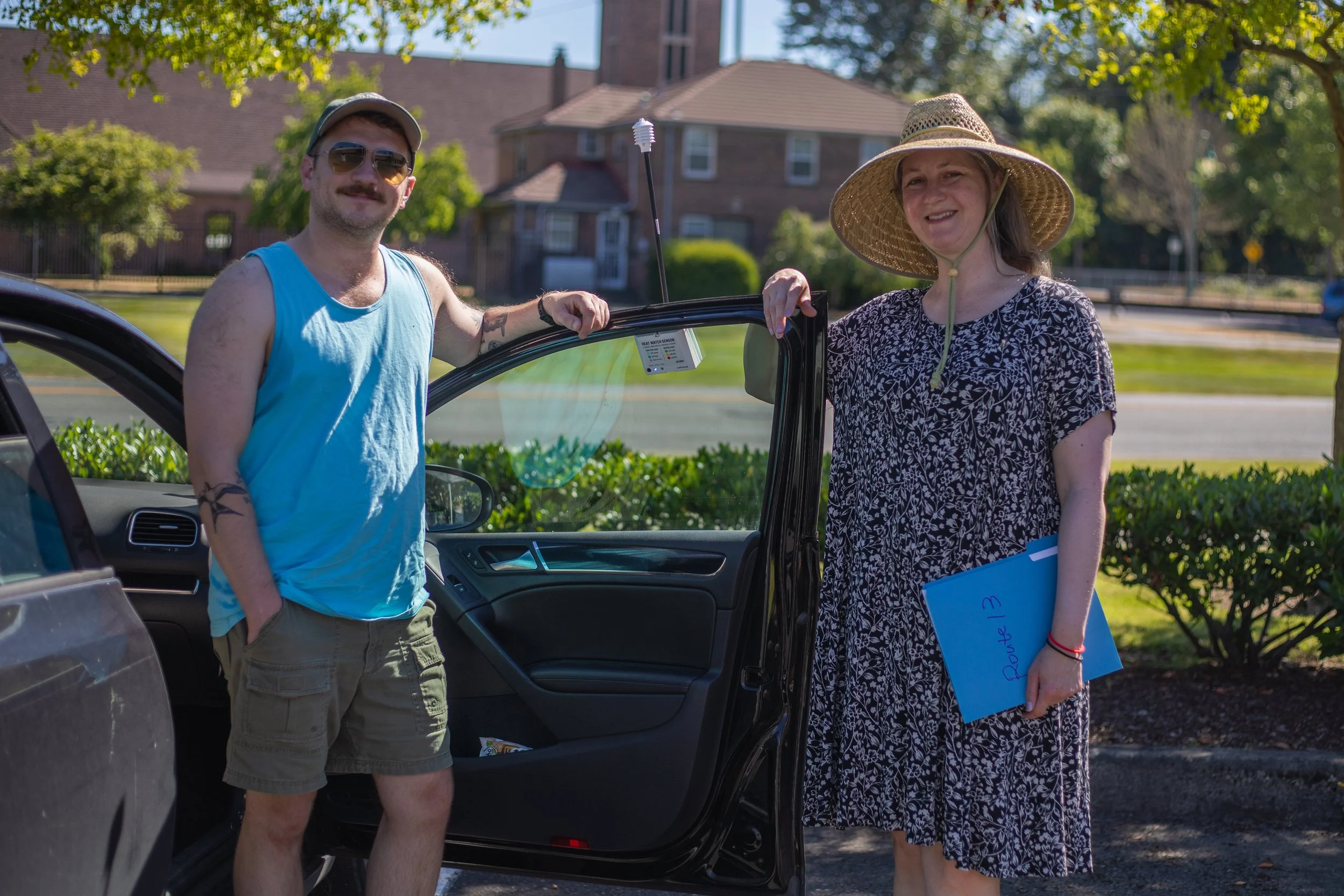
The Tacoma Tree Foundation led the outreach and volunteer effort, publishing a web page and online campaign that raised awareness about urban heat islands. Volunteers were required to participate in a training to learn about the urban heat island effect and how to correctly use the heat and humidity sensors that would be attached to their passenger side windows.

One challenge for our event planning team was that we needed to pick a day when temperatures were expected to reach more than 80°F. For that reason, we had to plan two preferred dates and two backup dates. Working with a climate scientist from the National Weather Service, we zeroed in on two August weekends and waited for the final forecast!
As August 4th approached, everything was ready, and the forecast was good. 32 volunteers were organized into teams of two: a driver and a navigator. Each group was assigned one out of 16 routes which they drove three separate times on the day of the mapping. The first drive was at 6:00am, the second at 3:00pm, and the last at 9:00pm, each lasting an hour. A speed of at least 35 mph had to be maintained for accurate data collection. The passenger was responsible for taking notes, as well as documenting any deviations from the assigned route.
On mapping day, the volunteer teams drove through Bonney Lake, Fife, Fredrickson, Gig Harbor, Lake Tapps, Lakewood, Midland, Parkland, Spanaway, South Hill, Sumner, and Tehaleh. There were three central hubs that volunteers could visit in between their drives for snacks, refreshments, and community-building. Afterward, the data was sent to CAPA strategies to be curated into heat maps.
Reading the Heat Map
The following maps are organized by the time of day the data was collected. The first maps and legends depict the temperature collected along the routes while the second set is a full heat map derived from the data.
Make sure to read the legends carefully. The temperature range on each map is relative to the time of data collection and the area around it. For example, the bluest part in the morning is 54°F, while the bluest on the evening map represents temperatures near 74°F. Keep this in mind as you observe temperatures throughout the day. The temperature trends upward throughout the day; therefore, the temperature range shifts accordingly.
As you explore the Pierce County heat map, zoom in and scroll around, change the time of day in the Layer List, and turn the transparency down so you can see your neighborhood.
What do you notice about the heat distribution?
How are areas closer to the water affected?
How many trees do you see in hotter areas versus cooler areas?
Where are the hottest and coolest pockets during different times of day?
A version of this interactive map is expected to be published by Pierce County in the coming months.
MORNING DRIVES (6:00am)


AFTERNOON DRIVES (3:00pm)


EVENING DRIVES (9:00pm)


CONCLUSION
Overall, 157 square miles of Pierce County urban area was mapped. The average temperature differential was 14.1° between the hottest and the coolest neighborhoods, with the largest being 20.6°F. These data show us where our County is the hottest, as well as how heat fluctuates throughout the day. This public data offers our region’s residents crucial access to information about where they live so they can make informed decisions moving forward as summers get hotter.
Just like urban heat, tree canopy coverage varies dramatically across Pierce County neighborhoods. Trees are our greatest ally as we prepare for future heat waves. Through shade and transpiration (water evaporation from their leaves), trees cool the air, streets, and buildings around them. They can lower the surrounding temperature up to 15°F and prevent heat related illness.
No matter where you live, trees can help make your community more heat-resilient, and there are resources to help you make that happen. Visit our Trees For Greater Tacoma page to find out what program is best for you. Go to our calendar to learn about our upcoming planting and educational events.